Jul 12, 2024
Logos are more than just marks—they're the entry point to a brand's story. In Logo Folio Vol.1, I’ve curated a selection of identities that showcase my approach to visual storytelling, where strategy meets form, and every curve has a purpose.
Author
READ
Category

Each logo in this collection reflects a different industry, voice, and message. Whether for a soulful restaurant, a travel agency, or a social initiative, the design process always starts with the same core: clarity, meaning, and adaptability.
These logos were developed to function across various mediums—print, digital, packaging, and signage—while maintaining a strong and consistent presence.
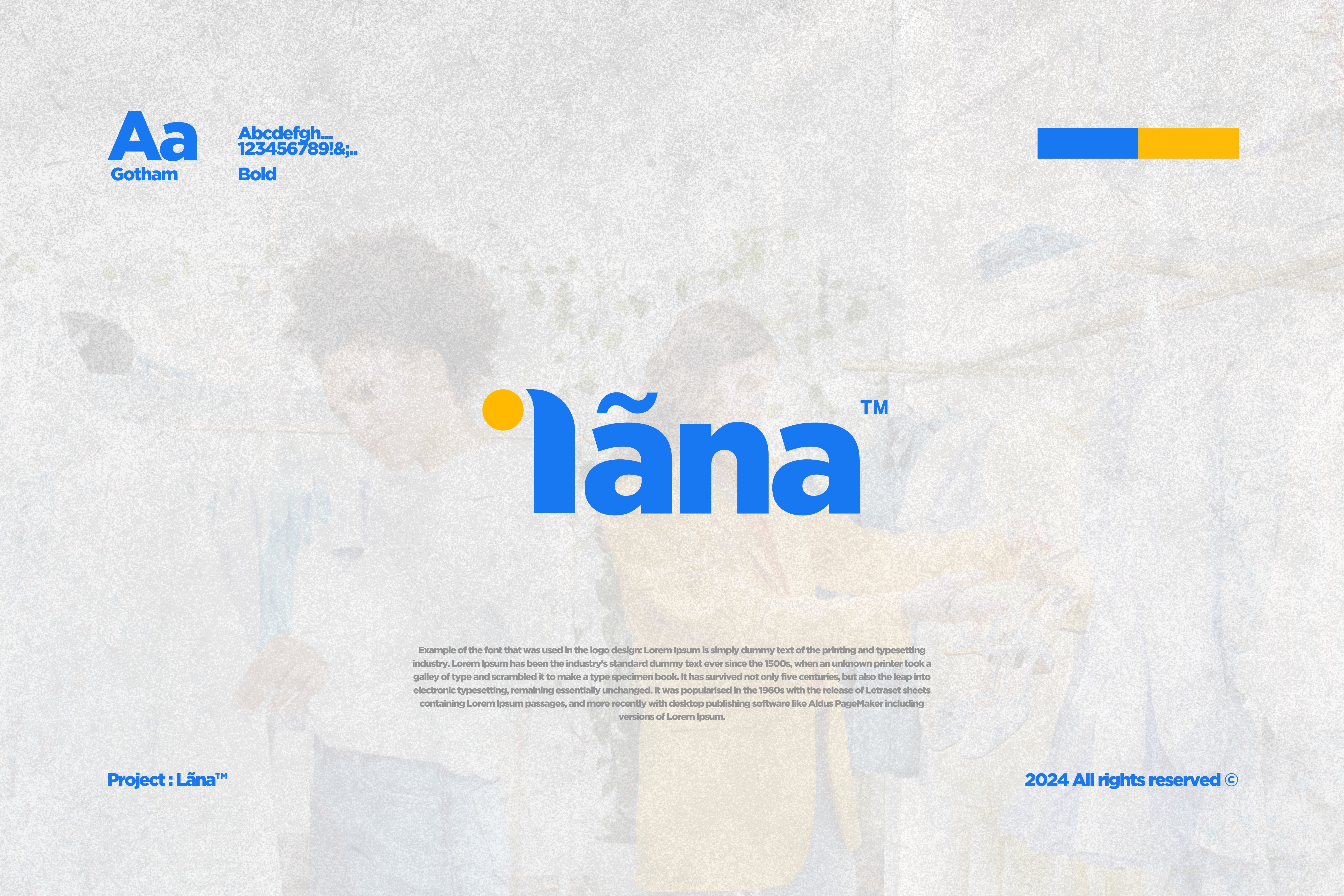

Behind every minimalist shape is a research-driven design process. Each concept begins with questions:
What does this brand stand for?
What do we want people to feel at first glance?
How will this logo live and grow over time?
Throughout this folio, you’ll see a variety of styles—geometric, expressive, typographic—but what connects them all is a shared foundation: intentional simplicity.

A good logo isn’t static—it’s a system. For each project featured in Volume 1, I worked beyond just a mark, creating mini identity systems with color, typography, visual language, and mockups. From travel and tech to food and culture, this folio showcases range and consistency in equal measure.
Designed to Adapt
Whether for digital-first brands or local businesses, the logos in this collection are built to adapt, scale, and evolve. From small screens to store signs, they hold their integrity and communicate clearly—no matter where they’re seen.


